Color guidlines with Nonstop Printing
Color in 4 Steps
If you do these 4 things, you will have more predictable color and maximize the color gammut.
- Visit www.nonstopprinting.com/understanding-color to understand color a bit more.
- Set up your Adobe Color Settings to gain control of your color workflow.
- Design with your brightness settings at 50%. When we compare print to screen, we use a Mac monitor at 50% brightness.
- Let us know whether you'd like us to target sRGB or Adobe RGB for RGB elements. For CMYK elements we only target to Gracol 2013 CRCP6.
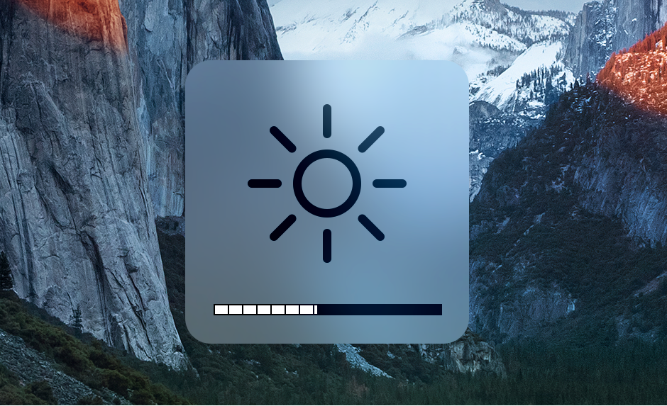
Why we compare out output to mac monitors
- Apple screens aren't perfect, but they're more consistent and enough people use them where you'll be able to find one to preview your work on if you're very concerned.
- when we compare our output to the screen, it comes closest to 50% brightness. This is especially important for darker images.
- if your images look to dark at 50%, brighten them up in photoshop.
Custom colors that are very important to hit?
Cost depends on the project, but for simple projects it adds about $75+ per color to the project. We don't like doing it because it can be very disruptive to our workflow and may also cause delays in your order, but we will if it's a non-negotiable.There are only two ways we'll feel confident about the color you're targeting:
- Preferred way: a physical sample mailed to us
- Second Best: Pantone selection from a physical pantone book "Pantone Solid Uncoated" or "Pantoned Soild Coated":
https://www.amazon.com/Pantone-GP1601A-Coated-Uncoated-Formula/dp/B07WWKJ7XZWhy: it's the only objective way for us to target. Pantone books are good because they try hard to keep their swatch books consistent. They're not perfect though. The same color between pantone books are slightly different, and most people don't spend $180 a year to keep their book color books accurate (including us). Color fades over time.

Related Articles
How to Change a Spot Color to a Process Color
Why change from a spot color to process color? You'll get your project done more economically and more quickly without spot colors. This is a great option if you aren't color critical about the pantone colors you selected. If you generally want us to ...Interested in more predictable color? Start here.
CMYK and RGB Values are Ingredients, not Color Think of a favorite recipe you've come up with or learned. Think of the flavor, the texture, the smell. Perfect right? You made it in your own space, with your own oven cookware, and your own tried and ...Set up your Adobe Color Settings to gain control of your color workflow.
Read Me First Excellent color management is like exercise. You cannot just set it and forget it - it takes constant management. First decide how intense you'd like to get around color: Easy Conservative Color This is more of a set it and forget it ...Visit Nonstop Printing
Visiting Hours If you're looking to drop by for a quick question or two it'd be best to visit from Monday-Friday 10:30am-5:00pm. This is when our team is fully staffed and our Customer Service Representatives can help with what questions or concerns ...Courier and Messenger Service from Nonstop Printing
We offer messenger service for local deliveries with a trusted partner. They're a small but extremely reliable team that we count on. Since it's a small team here's what you can expect: same day delivery cut-off time is 12pm. That means we need to ...