How to use the file check up to improve quality and color. Open in Adobe Acrobat only.
Read Me First!
Step 1 - Download and Open report in Adobe Acrobat ONLY

Your custom built report will help you avoid common pitfalls and will elevate your final product. Here's how:
- Open our report file with Adobe Acrobat (https://get.adobe.com/reader/) only or else you won't see the bookmarks.
- Look at the table of contents above to get more info about the warnings and how to troubleshoot your file to get the best print quality.
If you open the report correctly, it'll look something like this. Notice all the bookmark locations. It shows you exactly where the issues are.
In newer versions of acrobat, you may need to click the button circled below.
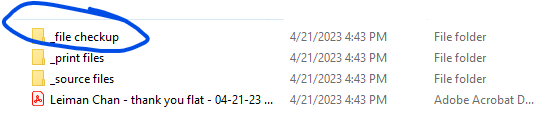
It'll be in a folder like the one below unless we link you the report directly.
Step 2 - How to understand this guide
We will frame the challenges in the framework below.
- On screen it looks...
Going from screen to print is a massive challenge. Almost everything looks great on screen but print needs certain settings to make sure it translates well.- But in print it looks
Here we'll illustrate what can happen if you let this error go to print.- Typical Fixes
Here we give tips on how to correct the issue.

What if I don't want to fix the errors!??!!
- Get it to your graphic designer. Connect us with the graphic designer directly. I promise you, it'll save you time and avoid massive miscommunication. This stuff is abstract to most people except for graphic designers. If you get this report to them, I can almost guarantee they will be impressed and will love it and have NEVER seen anything like it and their mind will be blownnnn!
- If you are the graphic designer and feel intimidated, it's ok I know it's a lot. Not every item has to be fixed. Check through the error list and it'll help break things down a bit and let you know how to assess. If you still have questions, reply to the email in the thread and ask for help. We don't mind sending a video explanation on really complicated things and we could even jump on a screen share!
- If you just don't have the time or don't have access, then if we really have to, we can typically still print but if something doesn't look good on the final product, that's on you. We invested a ton into this technology because some bad print is a result of having poor files. Most issues need to be fixed by the native file which is from graphic designer.
Items the report cannot catch
Book Flow and Hinge Issues
Within the same folder you'll see a proof file. That proof file allows you to see three things that the file checkup cannot catch.
- artwork that is lost in the hinge of the book. Check the inside front and inside back cover to see if the artwork looks too cut off. You lose about .25" on both sides of the page.
- is any critical part of the artwork in the center of the spine? Things that are particularly strongly discouraged is having faces or text in the spine. It will not look good
- does the flow of the book make sense? do the spreads make sense?
Moiré Patterns
Within the same folder you'll see a proof file. That proof file allows you to see three things that the file checkup cannot catch.
- artwork that is lost in the hinge of the book. Check the inside front and inside back cover to see if the artwork looks too cut off. You lose about .25" on both sides of the page.
- is any critical part of the artwork in the center of the spine? Things that are particularly strongly discouraged is having faces or text in the spine. It will not look good
- does the flow of the book make sense? do the spreads make sense?
On Screen Morai patterns look...
Great. Here's an example below.
At 300% zoom...But in print it looks...
Weird. Like the screenshots below.
Typical fixes:
- If designing at the same document size as your final product and you're zoomed in at 300% and you still see tiny details like the screenshot abvove, you will likely see the pattern distort in the actual print.
- Rasterize in Photop or Illustrator. How to rasterize complex vector objects
Error List Ranked in Priority
Failure (Font has missing glyphs or font not found)
On screen it looks...Great! Who cares?
But in print it looks...We won't be able to print. This crashes our computers.Typical fixes:In this particular case, we had to delete the "JAILBREAK" because we don't have the native file. If you see this error, try to outline all the fonts on the page it's flagging or try using a different font.
Potential image dropout or wild color differences.
On screen it looks...
In your source file, it'll look great! In the proof, we try to show what happens when we try to print. We've seen things disappear or have very strange color. Screenshot examples below.
But in print it looks...Things disappear or the color can look wildly differnt.
OriginalActual Print. The entire image dropped out. We think it's because there are CMYK and RGB elements layered. Our system doesn't know how they should "Blend" together.Here's another example:
Original. The images here are intended to be black and white.
Actual Print. This particular graphic designer used an image underneath that was color, and then placed a rectangle and desaturated the color to make it grayscale. Our system does not know how to handle that. Each image should have been converted to grayscale in Photoshop or some other image editor.
Typical fixes:
- Layering can be tricky. If you use advanced layering techniques like the examples above, you should flatten your artwork in Adobe Acrobat Pro.
Typical fixes:
- Layering can be tricky. If you use advanced layering techniques like the examples above, you should flatten your artwork in Adobe Acrobat Pro.
White text fill is set to overprint.
On screen it looks...
Great! Who cares?
But in print it looks...
It's really bad. That object will disappear when printed.
What you see.
What prints. The only way to catch it digitially is to open "Output Preview" in Adobe Acrobat Pro.
Typical fixes:
- In Illustrator or InDesign. Click on that object. At the top panel go to something like Window - Output - Attributes.
- Then uncheck the box that says "Overprint"
Bleed potentially missing.
On screen it looks...Great! Who cares?But in print it looks...like the edges of your book will have thin white lines like the screenshot below.Typical fixes:
- Use programs like InDesign and Illustrator and checking out our PDF Export Settings which discusses bleed and optimal export settings.
- If you're using Canva then check out this guide How to create print-ready files from Canva
Low Resolution Errors and Warnings
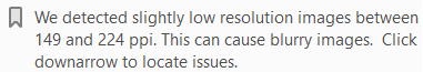 On screen it looks...
Great! Screen resolution only needs to be at 75dpi to look good because there's software built in that makes things automatically look better.But in print it looks...Could be good or bad. The best way to determine whether the output is acceptable is to use our 300% test to check for resolution. If your PDF at 300% looks sharp, we'll print it sharply. Looking at your PDF at 300% is like looking at your actual physical print 6 inches away from your eyes.Typical fixes:
- find a different image with higer res.
- make your print/image smaller
- find a better resolution version of the image.
- check missing links in InDesign if it's really bad.
- visit https://www.upscale.media/
Text size is less than 8 pt for text with more than 1 separation...
On screen it looks...great!But in print:
- they will look fuzzy because our print cannot print that small. You will still typically see text within 5-8pt but it won't be very sharp.
- tougher colors with small text: greens, oranges, browns
Typical fixes:
- make the text as big and as thick as possible.
- in your cmyk sliders, add as much black as you can because it helps sharpen text
- for perfectly sharp text, use 100% black
Text size is less than 8pt for white text...
On screen it looks...Great!But in print it looks...Potentially terrible because with white text on colored backgrounds, the CMY and K channels are tryign to perfectly line up.
- instead of white text it may look slightly yellow, magenta, or cyan when the color is slightly off register
- the text can look fuzzy or sometimes even completely illegible.
Typical fixes:
- use bigger text and thicker text. the bigger the better
- invert your color. I know it probably looks better with white on black text, but in print, typically you'll see the opposite because it's easier to print and it typically looks better.
- for perfect clarity, use 100% black BUT know that it won't be very black. It'll be more like a gray-ish black. But as soon as you introduce CM or Y you will have potential color to color defects.
Rich black set too high (100C,100M,100Y,100K)
On screen it looks...Great!But in print it looks...
- Potentially terrible because the CMY and K channels are trying to perfectly line up and it isn't always perfect. Ttext can look fuzzy or sometimes even completely illegible.
- Causes print to smear and defect because there is too much ink
- Will cause delays until you fix the issue.
Typical fixes:
- use bigger text and thicker text. the bigger the better
- for perfect HD level clarity, use 100% black only.
Image is not tagged with an ICC profile...
On screen it looks...Great! You're looking at your PDF with the same "kind" of RGB and CMYK as you always haveBut in print...:
- you may see some startling color differences
- some images may look "blown out"
- some images may too warm/cold/green
- you may lose a little or a lot of shadow detail
- colors may look dull.
Typical fixes:Let us know if you want us to target sRGB or Adobe RGB.What if I do nothing?Our proofs DO tag an ICC profile if you do not, so if things look OK in the proof IN ADOBE ACROBAT (reader or pro is fine) then know that you are looking at a similar target we are. Virtually every monitor you see is NOT color calibrated so there will always be differences within devices. If you're super concerned about color, you'll want to request a physical proof to be made. This will prolong your turnaround and proofs start at $150+ if you haven't paid for a larger project with us.
Related Articles
What the file checkup cannot catch.
The file checkup is an incredible tool to help produce the best quality product, but it can't catch everything. The proof file helps catch some of these things. Digital Proof Actual Book Proof File This is the first PDF file you'll see in the folder ...Recommended PDF Export Settings for Print within InDesign
But first, control the bleeds! For the highest quality and fastest production times, this step is critical before exporting your final file. Part I - Set up your artwork with bleeds Go to file-document settings and adjust your bleed to .125". The ...Set up your Adobe Color Settings to gain control of your color workflow.
Read Me First Excellent color management is like exercise. You cannot just set it and forget it - it takes constant management. First decide how intense you'd like to get around color: Easy Conservative Color This is more of a set it and forget it ...Using Output Preview to Check Spot Colors
This is one of our most used tools for more technical projects. Using output preview helps us quickly determine if a file is set up correctly for spot color processes. Requirements: Adobe Acrobat and a PDF file. Open adobe acrobat and select tools on ...How to Change a Spot Color to a Process Color
Why change from a spot color to process color? You'll get your project done more economically and more quickly without spot colors. This is a great option if you aren't color critical about the pantone colors you selected. If you generally want us to ...